

Learn Full-Stack Web Development with React and GraphQL by Building a Sticky Note App - Part one
The Front-End Aspect


Table of contents
- Introduction
- What are We building?
- The Structure of this Tutorial
- Prerequisites
- Tools
- The GitHub Repository for this Project
- The Deployed Website
- Getting Started
- Updating the styles/global.css file
- Creating the NoteCard Component
- Creating A New Sticky-Note
- Changing the Theme Color
- Minimizing and Maximizing a Stick Note
- Deleting A Sticky Note
- Summary and Next Step
Introduction
👋 Hello everyone! This is a full-stack tutorial on how to build a Sticky Note app using GraphQL, React, and TypeScript.
GraphQL is a modern and advanced way of creating APIs that provides a flexible and efficient way to request data from a server. It was developed by Facebook and released publicly in 2015.
One of the major selling points of GraphQL is that it allows the client to request only the data it needs, nothing more and nothing less, rather than getting a fixed set of data from an endpoint. This can be more efficient and reduce the amount of data transferred over the network, which can be particularly useful when building mobile applications or when working with limited bandwidth.
What are We building?
We are developing Sticky Notes, a full-stack note-taking web application that enables you to do the following:
Create and edit notes: create and manage your sticky notes everywhere you are on your computer or mobile device.
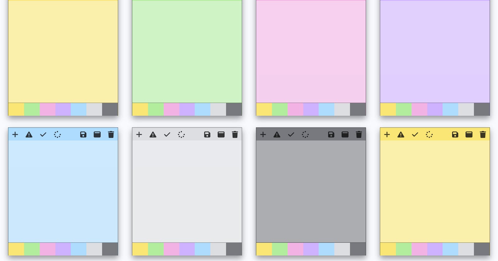
Customize appearance: The background colors of your Sticky Notes can be changed and you can choose from seven different theme colors.
Create an account: sign up and create a new account to keep all your notes secure.
Auto-Save: Automatically save changes to your note as you are typing them, ensuring that changes to a note are not lost, even if the app or device crashes or the user closes the browser.
Manually save note: You can also manually save your note by clicking on the save icon.
Minimize or Maximize note: Maximize your note to concentrate only on the note you are working on or you can minimize to see all the notes you are working on.
Delete Note: You can permanently remove your Sticky Notes if they are no longer needed.
The Structure of this Tutorial
This tutorial is divided into three parts: frontend, backend, and fullstack.
The Frontend
The frontend section will focus on building the app using only React and TypeScript. We will use React to create the user interface and manage the state of the app. The purpose of this part is to demonstrate how the app works with React state before transitioning to using the Apollo GraphQL Client in the final section.
The Backend
This is the second part of the tutorial. In this section, we will build the GraphQL server for the app using Apollo Server 4, Express.js, Nexus, and MongoDB. We will define the schema and resolvers for our GraphQL API, as well as handle authentication, authorization, and data persistence.
The Fullstack
This is the final part of the tutorial. In this part, we will make the frontend communicate with the GraphQL server built in the backend and migrate the app state from the React state to the Apollo client cache.
Prerequisites
To get started with the frontend aspect of this tutorial, it is assumed that you are familiar with the following tools:
HTML and CSS: Since most of the HTML and CSS code used in this tutorial won't be discussed, a good understanding of HTML and CSS is expected.
JavaScript: A good knowledge of JavaScript is required. If you are already familiar with ES6 features such as the fat arrow function and object destructuring, you are ready to go.
React: You are good to go if you have interacted with a React state and component or, even better, created a to-do app with React.
TypeScript: Basic knowledge of TypeScript is what is needed here; if you already know what TypeScript is and why it's being used in the tech industry, along with your JavaScript skills, you're set to start.
Tools
The following tools will be used to build the frontend aspect of this tutorial:
Nodejs
React
TypeScript
Nextjs
Font Awesome
The GitHub Repository for this Project
The GitHub repository containing the finished code for this app can be found here:
Frontend: https://github.com/tope-olajide/sticky-note-react
Backend: https://github.com/tope-olajide/sticky-notes-backend
Fullstack: https://github.com/tope-olajide/sticky-notes
The Deployed Website
I deployed the frontend code of this project on Vercel and hosted the backend code on Render.
You can use the following link to view the deployed website for each section:
Frontend: sticky-note-react.vercel.app
Backend: https://sticky-note-app.onrender.com/graphql
Fullstack: sticky-note-app.vercel.app
Getting Started
Create a new directory called sticky-note-frontend. Navigate to the folder on your termainal and run the following command:
yarn create next-app --typescript
When asked for your project name, either type ./ to use the name of your current folder or manually type in the name of your project.
Next, you will be prompted to decide if you will like to use ESLint, select Yes.
After that, you'll need to wait for some seconds for Nextjs to finish installing TypeScript, React, and other dependencies.
After the installations, Nextjs will set up TypeScript support for our project and add a few folders and files to the root directory.
Let's install font awesome by running the following command on the terminal:
yarn add @fortawesome/fontawesome-svg-core @fortawesome/free-solid-svg-icons @fortawesome/react-fontawesome
Finally, we can run the following command on the terminal to start our frontend development server:
yarn run dev
The command will start our frontend development server on the following URL: http://localhost:3000.
Launch your browser and visit: http://localhost:3000 on it, you should see a "Welcome to Next.js!" screen that looks like this:

By default, Next.js will look for a file at pages/index.ts and render the contents of that file as the default page for the root URL. If a file at pages/index.ts does not exist, Next.js will display an error message.
We will be modifying the pages/index.ts file soon but before then, let's create a new folder inside the root directory called: components.
The components folder will be used to store all the react components that we will be creating very soon.
Updating the styles/global.css file
Open up the styles/global.css file in your editor and replace everything inside with the following code:
body {
  margin: 0;
  font-family: -apple-system, BlinkMacSystemFont, 'Segoe UI', 'Roboto', 'Oxygen',
    'Ubuntu', 'Cantarell', 'Fira Sans', 'Droid Sans', 'Helvetica Neue',
    sans-serif;
  -webkit-font-smoothing: antialiased;
  -moz-osx-font-smoothing: grayscale;
  background-color: #F8FAFE;
  overflow: auto;

}

code {
  font-family: source-code-pro, Menlo, Monaco, Consolas, 'Courier New',
    monospace;
}
.main-container {
 min-height: 100vh;
  display: flex;
  flex-direction: column;
  justify-content: space-between;
}
.card, .delete-note-modal{
  width: 300px;
  height: 350px;
  background-color: #f9e675;
   box-shadow: 0 8px 16px 0 rgba(0,0,0,0.4);
  border: 1px solid rgb(0, 0, 0,.5);
  margin: 1rem;
}
.delete-note-modal {
text-align: center;
display: flex;
align-items: center;
flex-direction: column;
justify-content: center;
}
.delete-note-modal h3 {
  margin: 0 0 1rem 0;
}

.delete-note-modal button {
  width: 90%;
  background-color: rgb(31, 15, 15);
}
.card-maximized {
  width: 100%;
  height: 100%;
  background-color: #f9e675;
  box-shadow: 0 8px 16px 0 rgba(0,0,0,0.4);
  border: 1px solid rgb(0, 0, 0,.5);
  position: fixed
  ;
  z-index: 10;
  overflow: hidden;
  display: flex;
  flex-direction: column;
  top: 0;

}
.card-header {
 height: 10%;
}

.card-body {
  background-color: rgba(253, 253, 253, 0.4);
  height: 80%;
}

.text-area {
width: 100%;
height: 100%;
background-color: transparent;
border: none;
outline: none;
color: black;
z-index: 5;
resize: none;
font-size: 1rem;
font-family:  'Segoe UI', 'Roboto', 'Oxygen';
font-weight: 400;

}

.text-container{
width: 90%;
height: 100%;
margin: 0 auto;
}

.card-footer {
  width: 100%;
  height: 10%;
  border-top: 1px solid rgba(0, 0, 0, 0.4);
}

.icon-container {
  display: flex;
  justify-content: space-between;
  align-items: center;
  height: 100%;
}

.right-icon, .left-icon {
    display: flex;
}

.icon {
  margin: 3px;
  color: rgb(12, 11, 11);
  padding: 5px 7px;
  cursor: pointer;
  opacity: .8;
  font-size: 1.2rem;
}

.icon:hover {
  background-color: rgba(10, 10, 9, 0.2);
  opacity: 1;
}

.theme-color-container {
  width: 100%;
  height: 100%;
  display: flex;
  background-color: black;
}

.theme-color:hover {
  opacity: .9;
  cursor: pointer;
}

.yellow, .green, .pink, .purple, .blue, .gray, .charcoal {
  width: 14.3%;

}

.yellow, #yellow {
background-color: #f9e675;
}

.green, #green {
  background-color: #b2ed9e ;
}
.pink, #pink {
  background-color: #f2b3e4;
}
.purple, #purple {
  background-color: #ceb1ff;
}
.blue, #blue {
  background-color: #addcfe;
}
.gray, #gray {
  background-color: #dcdee2;
}
.charcoal, #charcoal {
  background-color: #77797e;
}
.notes-container {
display: flex;
flex-wrap: wrap;
justify-content: space-evenly;
}

.no-notes-container {
  display: flex;
  flex-direction: column;
  width: 350px;
  margin: 4rem auto;
  align-items: center;
  border: 1px solid rgba(0, 0, 0, 0.2);
  padding: 3rem 1rem;
  box-shadow: 0 2px 4px 0 rgba(0,0,0,0.4);
  background-color: #f9e675; ;
}
.no-notes-container button {
  background-color: #09060e; ;
}


.auth-container{
width: 350px;
margin: 2rem auto;
padding: 2rem;
box-shadow: 0 2px 4px 0 rgba(0,0,0,0.4);
background-color: white;
}

.auth-form{
flex-wrap: wrap;
display: flex;
width:320px;
margin: 0 auto;
justify-content: center;
}
.auth-container h3 {
 text-align: center;
}
input {
border: 1px solid black;
margin: .5rem;
padding: 1rem;
font-size: 1rem;
width:320px;
outline: none;
}

.navbar{
  background-color: rgb(34, 32, 32);
  padding: 1rem;box-shadow: 0 2px 4px 0 rgba(0,0,0,0.4);
  display: flex;
  justify-content: space-between;
  align-items: center;
}

.navbar h1{
  margin: 0;
  font-size: 1.3rem;
  padding-left: 1rem;
  color: white;
}

.navbar .menu {
  display: flex;
}

.navbar .menu h5{
  margin: 0;
  color: white;
  padding: 0 1rem;
  text-transform: uppercase;
}

.navbar .menu h5:hover {
  opacity: .8;
  cursor: pointer;
}

.welcome-text h2{
  text-align: center;
  text-transform: uppercase;
  margin: 2rem 0 0rem 0;
}

button {
  border: none;
  margin: .5rem;
  padding: 1rem;
  font-size: 1rem;
  width:320px;
  outline: none;
  background-color: blue;
  color: white;
  cursor: pointer;
}

button:hover {
  opacity: .7;
}
.logout-button{
  width: 80px;
  padding: .5rem;
  border-radius: 3px;
  margin: .1rem;
  font-size: .9rem;
}
.show-error{
  display: flex;
  flex-direction: column;
  align-items: center;
}
.show-error p {
  color: red;
  margin: 0;
  font-weight: 600;
}
.hide-error{
  display: none;
}
.error-icon {
margin:0;
color: red;
padding: .4rem;
}

.snackbar-container {
  min-width: 250px;
  background-color: rgb(29, 29, 32);
  color: #fff;
  text-align: center;
  border-radius: 2px;
  position: fixed;
  z-index: 1;
  right: 0%;
  bottom: 30px;
  font-size: 17px;
  padding: 0;
  margin-right: 30px;
  box-shadow: 0 8px 16px 0 rgba(0,0,0,0.4);
}
.hide{
  display: none;
}

 @media screen and (max-width: 468px) {
  .auth-container{
    width: 90%;
    padding: 2.5rem 0;
    }
    .auth-form {
      width:90%;
      }
      .navbar h1{
        font-size: 1rem;
        padding-left: 0.5rem;
      }
      .navbar .menu h5{
        font-size: .7rem;
      }
}

@media screen and (max-width: 280px) {
  .auth-container {
    width: 100%;
    }
}

footer {
width: 100%;
left: 0;
bottom: 0;
background-color: black;
text-align: center;
color: white;
margin-top: 5rem;
}

footer p {
  padding: 2rem 0;
}
Inside the styles directory, delete the Home.module.css file, we won't be needing it.
Creating the NoteCard Component
Open up the components directory and create a new file called NoteCard.tsx inside it.
The NoteCard component will serve as a template that will be used to create a new sticky note.
Open up the NoteCard.tsx file and add the following code:
import { FontAwesomeIcon } from '@fortawesome/react-fontawesome'
import { faPlus, faWindowMaximize, faTrash, faSave, faExclamationTriangle, faSpinner, faCheck } from '@fortawesome/free-solid-svg-icons'

const NoteCard: React.FC = () => {
    return (
        <>
            <div className="card">
                <div className="card-header">
                    <div className="icon-container">
                        <div className="left-icon">
                            <div className="icon"><FontAwesomeIcon icon={faPlus} /></div>
                            <div className="icon" ><FontAwesomeIcon icon={faExclamationTriangle} /></div>
                            <div className="icon" > <FontAwesomeIcon icon={faCheck} /></div>
                            <div className="icon" > <FontAwesomeIcon icon={faSpinner} spin /></div>
                        </div>
                        <div className="right-icon">
                            <div className="icon"><FontAwesomeIcon icon={faSave} /></div>
                            <div className="icon"><FontAwesomeIcon icon={faWindowMaximize} /></div>
                            <div className="icon"><FontAwesomeIcon icon={faTrash} /></div>
                        </div>
                    </div>
                </div>
                <div className="card-body">
                    <div className="text-container">
                        <textarea className="text-area"></textarea>
                    </div>
                </div>
                <div className="card-footer">
                    <div className="theme-color-container">
                        <div className="theme-color yellow"> </div>
                        <div className="theme-color green"></div>
                        <div className="theme-color pink"></div>
                        <div className="theme-color purple"></div>
                        <div className="theme-color blue"></div>
                        <div className="theme-color gray"></div>
                        <div className="theme-color charcoal"></div>
                    </div>
                </div>
            </div>
        </>
    )
}
export default NoteCard
The NoteCard component is the react version of the card-single.html file which can be found inside the templates repository.
Next, we'll create a new file inside the components directory called NoteContainer.tsx.
Open up the newly created NoteContainer.tsx file in your editor and add the following code:
import NoteCard from "./NoteCard";

const NoteContainer = () => {
    return (
        <>
            <section className="notes-container">
                <NoteCard />
            </section>
        </>
    )
}

export default NoteContainer
We imported and rendered the NoteCard component inside the NoteContainer.
To see all our components in action, open the pages/index.ts file and delete everything inside it, then import and render the NoteContainer component in it like so:
import NoteContainer from "../components/NoteContainer";

function HomePage() {
  return <NoteContainer />
}

export default HomePage
If everything works fine, the screen should display a sticky note that looks like this:
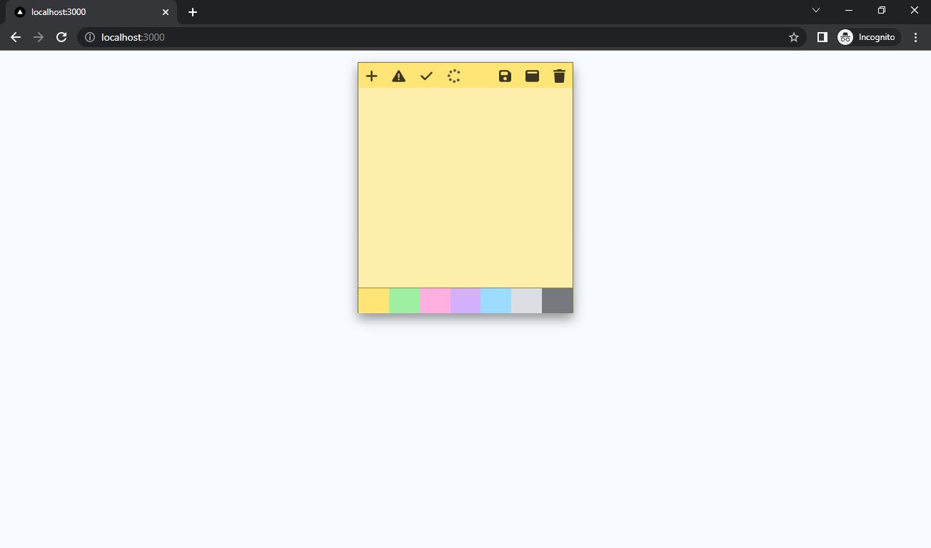
If you have checked out the completed version of this project from the link provided earlier, you already know what each icon on the sticky note card represents and what they will be used for. We will implement all the features very soon.
Creating A New Sticky-Note
In this part, we will add another sticky note once a user clicks on the plus icon on a sticky note or the Add new button that will be created very soon.
At the root folder of our project, let's create a new folder called typings. All the typings file used for this project will be saved here. Inside the typings file, let's create a new file called index.tsx. open the index.tsx file, and create a new enum type called Theme:
export enum Theme {
    Yellow = "yellow",
    Green = "green",
    Pink = "pink",
    Purple = "purple",
    Blue = "blue",
    Gray = "gray",
    Charcoal = "charcoal"
}
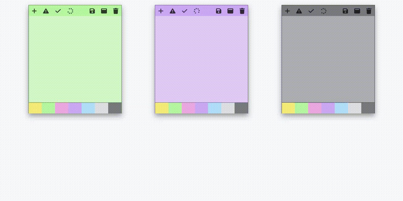
We're using the enum keyword to declare all the theme colors available for use in our sticky notes app, which are:
Yellow
Green
Pink
Purple
Blue
Gray, and
Charcoal
Let's create another type definition for each sticky note called INote:
export interface INote {
    content: string;
    color: Theme;
    id: string;
    isMaximized: boolean;
    isDeleteNoteConfirmationVisible:boolean;
    isSaved: boolean;
    isSaving: boolean;
    isError: boolean;
}
We set some rules for the note data; for example, each note content and id must be in string format, the color must conform with the Theme rules, and isMaximized, isDeleteNoteConfirmationVisible, isSaved, isSaving, isError as boolean. Inside the NoteContainer component, let's create a new object called defaultNoteData:
    const defaultNoteData = {
        content: "",
        color: Theme.Yellow,
        id: `${Date.now()}`,
        isMaximized: false,
        isDeleteNoteConfirmationVisible: false,
        isSaved: false,
        isSaving: false,
        isError: true,
    }
The defaultNoteData object will be used to set the default value of the newly created note. The note content will be initialized with an empty string, and the default theme color will be yellow. I used Date.now() method to generate a temporary id for the sake of building the frontend part of this project.
The original id will be generated from the backend and will replace the temporary id once the note data is saved into the database. Also, notice how Template Literal was used to convert the Date.now() value to string. The rules we set for the id type is string, but the Date.now() return type is number so we converted it to string
Now, let's import the Theme and INote typings we created earlier into the NoteContainer:
import { Theme, INote } from '../typings'
After that, we will create a new state called notes in the NoteContainer. To do that, let's import the useState hook from react first:
import { useState } from 'react';
Then create the notes state below the defaultNoteData object like this:
const [notes, setNotes] = useState<Array<INote>>([]);
The notes state is an Array of the INote object type we created earlier. If any notes data provided does not conform with the Array of INote type, expect TypeScript to throw some errors.
Next, we will create a function that creates a new sticky note below the notes state:
    const createNote = () => {
        setNotes([...notes, defaultNoteData]);
        console.log(notes);
    }
The createNote function will create a new sticky note by inserting the defaultNoteData object into the notes state anytime we call the createNote function.
Next, we will invoke this function when a user clicks on the plus icon on a sticky note.
Define the type for the NoteCard component.
Let's create a new interface called INoteCardProps for the NoteCard component.
Open up the typings/index.ts file and create a new interface called INoteCardProps
export interface INoteCardProps {

}
The INoteCardProps will be used to provide type checking for the NoteCard component props which will be discussed very soon, but before then let's update the NoteCard component to use the INoteCardProps types.
In the NoteCard component, replace the following line of code:
const NoteCard: React.FC = () => {
With this:
const NoteCard: React.FC<INoteCardProps> = (props) => {
Notice how we passed a props as parameters to the NoteCard component. The props stand for properties in React. It is used for passing data from a parent component (the NoteContainer in this case) to a child component (the NoteCard). The React.FC (can also be written as React.FunctionComponent) is just like an interface that provides the props types (INoteCardProps in our case) for a React component (NoteCard).
Let's import the INoteCardProps into the NoteCard component like this:
import { INoteCardProps } from '../typings'
and update the INoteCardProps with more data:
export interface INoteCardProps {
    createNote(): void;
    id:string;
    color:string;
    isMaximized:boolean;
    contents: string;
    isSaved: boolean;
    isSaving: boolean;
    isError: boolean;
}
After that, we'll update the NoteContainer to render the NoteCard component with the notes data.
Replace the following lines of code in the NoteContainer component:
<section className="notes-container">
                <NoteCard />
            </section>
with the following snippets:
            <section className="notes-container">
                {notes.map((note: INote) => {
                    return (
                        <NoteCard
                            createNote={createNote}
                            key={note.id}
                            id={note.id}
                            color={note.color}
                            isMaximized={note.isMaximized}
                            contents ={note.content}
                            isSaved={note.isSaved}
                            isSaving={note.isSaving}
                            isError={note.isError}
                        />
                    )
                })}
            </section>
We iterated through the notes state and rendered each data with the NoteCard components. If we refresh the browser now, we should see a blank page.
There's no need to panic; this occured because the notes state is empty. Remember, we initialized it with an empty array, therefore React has nothing to render just yet. To fix that, we need to create a component that will be rendered anytime the state is empty. This component will inform the user that they have not added any notes, it will also include an Add New button that will be used to invoke the createNote function.
Creating the NoStickyNotes Component
To create the NoStickyNotes Component, let's create a new file called NoStickyNotes.tsx and add the following code in it:
const NoStickyNotes: React.FC = (props) => {
    return (
        <>
            <section className="no-notes-container">
              <h3>You have no sticky notes</h3><button> Add New </button>
            </section>
        </>
    )
}
export default NoStickyNotes
This component will display a text that says: "You have no sticky notes" with an Add New Button. This button does nothing for now. Let's make it call the createNote function once a user clicks on it.
Open up the typings/index.ts file and create another type definition for the NoStickyNotes component called INoStickyNotesProps:
export interface INoStickyNotesProps{
    createNote():void
}
Now let's update the NoStickyNotes component to use the INoStickyNotesProps type definitions:
import { INoStickyNotesProps } from "../typings"


const NoStickyNotes: React.FC<INoStickyNotesProps> = (props) => {
    return (
        <>
            <section className="no-notes-container">
              <h3>You have no sticky notes</h3><button onClick={props.createNote}> Add New </button>
            </section>
        </>
    )
}
export default NoStickyNotes
First, we imported the INoStickyNotesProps from the typings.tsx file, then invoke the createNote function anytime the "Add New" button is clicked.
The createNote function will be passed down as props to the NoStickyNotes component from the NotesContainer component soon.
Let's render the NoStickyNotes component in the NotesContainer component only when the notes state array is empty:
Open up the NotesContainer component and import the NoStickyNotes component:
import NoStickyNotes from "./NoStickyNotes";
Then add the following snippets below the createNote function and right above the return method:
    if (!notes.length) {
        return (
            <>
            <section className="notes-container">
                <NoStickyNotes
                    createNote={createNote}
                />
                </section>
            </>
        )
    }
We told React to render the NoStickyNotes components when the notes state array is empty. Also, notice how we pass down the createNote function as props to the NoStickyNotes component:
createNote={createNote}
If you check your browser now, you should see the NoStickyNotes component being rendered on the screen like this:
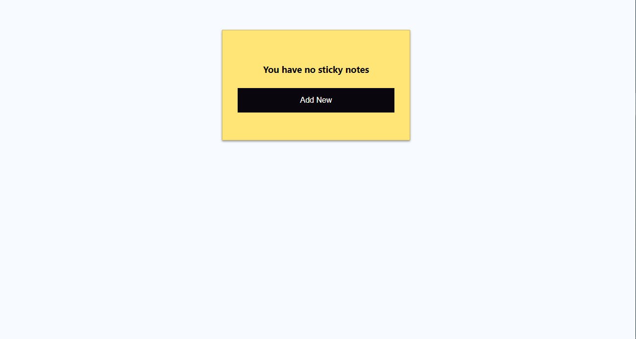
And when you click on the "Add New" Button, an empty sticky note with the defaultNoteData should be created, but nothing happens when you click on the plus icon. We will fix that in the section below.
Creating A New Sticky Note When a User Clicks on the Plus Icon
We want to be able to add more notes when a user clicks on the plus icon on any of the sticky notes. All we have to do now is to invoke the createNote function once the plus icon is clicked.
Let's open up the NoteCard component and locate this line of code inside the left-icon section:
<div className="icon"><FontAwesomeIcon icon={faPlus} /></div>
then replace it with the following snippets:
<div className="icon" onClick={props.createNote}><FontAwesomeIcon icon={faPlus} /></div>
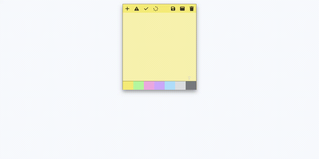
And now, we can create as many notes as we want when we click on the plus icon:

Here's how the NoteContainer component is looking at the moment:
// NoteContainer.tsx
import NoteCard from "./NoteCard";
import { Theme, INote } from '../typings'
import { useState } from 'react';
import NoStickyNotes from "./NoStickyNotes";

const NoteContainer = () => {
    const defaultNoteData = {
        content: "",
        color: Theme.Yellow,
        id: `${Date.now()}`,
        isMaximized: false,
        isDeleteNoteConfirmationVisible: false,
        isSaved: false,
        isSaving: false,
        isError: true,
    }

    const [notes, setNotes] = useState<Array<INote>>([]);

    const createNote = () => {
        setNotes([...notes, defaultNoteData]);
        console.log(notes);
    }
    if (!notes.length) {
        return (
            <>
            <section className="notes-container">
                <NoStickyNotes
                    createNote={createNote}
                />
                </section>
            </>
        )
    }
    return (
        <>
            <section className="notes-container">
                {notes.map((note: INote) => {
                    return (
                        <NoteCard
                            createNote={createNote}
                            key={note.id}
                            id={note.id}
                            color={note.color}
                            isMaximized={note.isMaximized}
                            contents={note.content}
                            isSaved={note.isSaved}
                            isSaving={note.isSaving}
                            isError={note.isError}
                        />
                    )
                })}
            </section>

        </>
    )
}

export default NoteContainer
And the NoteCard component should be looking like this:
// NoteCard component
import { FontAwesomeIcon } from '@fortawesome/react-fontawesome'
import { faPlus, faWindowMaximize, faTrash, faSave, faExclamationTriangle, faSpinner, faCheck } from '@fortawesome/free-solid-svg-icons'
import { INoteCardProps } from '../typings'

const NoteCard: React.FC<INoteCardProps> = (props) => {
    return (
        <>
            <div className="card">
                <div className="card-header">
                    <div className="icon-container">
                        <div className="left-icon">
                        <div className="icon" onClick={props.createNote}><FontAwesomeIcon icon={faPlus} /></div>
                            <div className="icon" ><FontAwesomeIcon icon={faExclamationTriangle} /></div>
                            <div className="icon" > <FontAwesomeIcon icon={faCheck} /></div>
                            <div className="icon" > <FontAwesomeIcon icon={faSpinner} spin /></div>
                        </div>
                        <div className="right-icon">
                            <div className="icon"><FontAwesomeIcon icon={faSave} /></div>
                            <div className="icon"><FontAwesomeIcon icon={faWindowMaximize} /></div>
                            <div className="icon"><FontAwesomeIcon icon={faTrash} /></div>
                        </div>
                    </div>
                </div>
                <div className="card-body">
                    <div className="text-container">
                        <textarea className="text-area"></textarea>
                    </div>
                </div>
                <div className="card-footer">
                    <div className="theme-color-container">
                        <div className="theme-color yellow"> </div>
                        <div className="theme-color green"></div>
                        <div className="theme-color pink"></div>
                        <div className="theme-color purple"></div>
                        <div className="theme-color blue"></div>
                        <div className="theme-color gray"></div>
                        <div className="theme-color charcoal"></div>
                    </div>
                </div>
            </div>
        </>
    )
}
export default NoteCard
Changing the Theme Color
We already have different theme colors selected for this app. All the available colors are provided in the Themes enum we created earlier, and they can be selected at the bottom of each sticky note.
What we are going to do next is allow a user to customize each note with a different color from the list of colors provided in the Themes type. To do that, we'll create a new function called createNote, this function will receive the noteId and the note color as parameters.
Inside the NoteContainer component, let's create the changeColor function right below thecreateNote function:
    const changeColor = (noteId: string, color: Theme) => {
        const updatedNotes = notes.map((note: INote) => {
            if (note.id === noteId) {
                return {
                    ...note, color
                }
            }
            return note
        })
        setNotes(updatedNotes)
    }
The changeColor function will iterate through the notes state using the Array.map method, if any of the ids of the note object inside the notes array matches the noteId provided in the parameter, it will change the color of the note to the color provided in the parameter. The map method will always return a new array, which will be stored into the updatedNotes variable.
In the NoteCard component, add id={props.color} to the <div className="card"> element like this:
<div className = "card" id = {props.color}>
Doing this means the background color in the id will be used instead of the background color in the class name. Remember Specificity in CSS, id selectors are given higher priority over class selectors.
Replace the following lines of code:
                <div className="card-footer">
                    <div className="theme-color-container">
                        <div className="theme-color yellow"> </div>
                        <div className="theme-color green"></div>
                        <div className="theme-color pink"></div>
                        <div className="theme-color purple"></div>
                        <div className="theme-color blue"></div>
                        <div className="theme-color gray"></div>
                        <div className="theme-color charcoal"></div>
                    </div>
                </div>
With the following snippets:
                <div className="card-footer">
                    <div className="theme-color-container">
                        <div className="theme-color yellow" onClick={() => props.changeColor(props.id, Theme.Yellow)} > </div>
                        <div className="theme-color green" onClick={() => props.changeColor(props.id, Theme.Green)}></div>
                        <div className="theme-color pink" onClick={() => props.changeColor(props.id, Theme.Pink)}></div>
                        <div className="theme-color purple" onClick={() => props.changeColor(props.id, Theme.Purple)}></div>
                        <div className="theme-color blue" onClick={() => props.changeColor(props.id, Theme.Blue)}></div>
                        <div className="theme-color gray" onClick={() => props.changeColor(props.id, Theme.Gray)}></div>
                        <div className="theme-color charcoal" onClick={() => props.changeColor(props.id, Theme.Charcoal)}></div>
                    </div>
                </div>
So anytime a user clicks on any color on the sticky note, it calls the changeColor function with the id and color of the note selected as arguments.
Update the import from the typing file in the NoteCard component to include the Theme like so:
import { INoteCardProps, Theme } from '../typings'
After that, update the INoteCardProps by adding changeColor(id:string, color:Theme): void; to it:
export interface INoteCardProps {
    createNote(): void;
    id:string;
    color:string;
    isMaximized:boolean;
    contents: string;
    isSaved: boolean;
    isSaving: boolean;
    isError: boolean;
    changeColor(id:string, color:Theme): void;
}
In the NoteContainer, let's pass down the changeColor function as props to the NoteCard component by adding changeColor={changeColor} to it so everything looks like this:
<section className="notes-container">
                {notes.map((note: INote) => {
                    return (
                        <NoteCard
                            createNote={createNote}
                            key={note.id}
                            id={note.id}
                            color={note.color}
                            isMaximized={note.isMaximized}
                            contents ={note.content}
                            isSaved={note.isSaved}
                            isSaving={note.isSaving}
                            isError={note.isError}
                            changeColor={changeColor}
                        />
                    )
                })}
            </section>
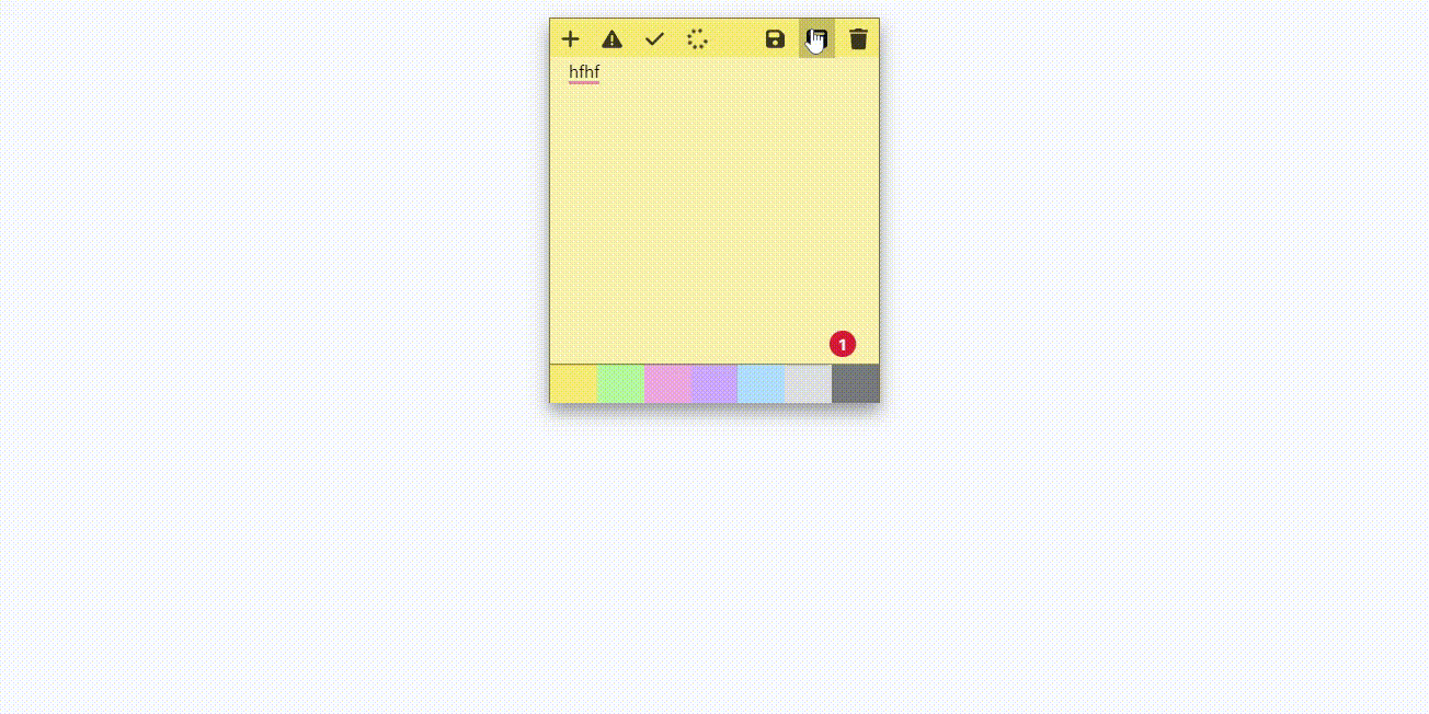
Now you can check your browser, select any color you want, and watch your sticky note's background color change like this:
Minimizing and Maximizing a Stick Note
In this part, we will implement the feature that will allow a user to work in a distraction-free mode by maximizing a sticky note to cover the screen and minimize it when they are done.
Create a new function called toggleFullscreen below the changeColor function:
    const toggleFullscreen = (noteId: string) => {
        const updatedNotes = notes.map((note: INote) => {
            if (note.id === noteId) {
                return { ...note, isMaximized: !note.isMaximized }
            }
            return note
        })
        setNotes(updatedNotes)
    }
The toggleFullscreen function takes the noteId of the note the user wants to maximize as a parameter, then toggles its boolean value. If the isMaximized value of the selected note is true, it changes it to false and if it's false it will be changed to true. That is exactly what this line does:
return { ...note, isMaximized: !note.isMaximized }
There are two classes in the styles/global.css called card and card-maximized. The card class is the default size of every sticky note while the card-maximized class contains the styles that will maximize the sticky note card. All we have to do is switch between both classes with react anytime the minimize and maximize icon is clicked.
In the NoteCard component, let's update the following snippets:
<div className= "card" id={props.color}>
with this one:
<div className={props.isMaximized ? "card-maximized" : "card"} id={props.color}>
When a sticky note's isMaximized property is true, the card-maximized class is used; otherwise, the card class is used.
Let's make the faWindowMaximize icon call the toggleFullscreen function with the id of the note anytime it is clicked.
Update the following code:
<div className="icon"><FontAwesomeIcon icon={faWindowMaximize} /></div>
With the following snippets:
<div className="icon" onClick={() => props.toggleFullscreen(props.id)}><FontAwesomeIcon icon={faWindowMaximize} /></div>
After that, we'll update the INoteCardProps object in the typing file to include the toggleFullscreen function with the noteId as parameters:
export interface INoteCardProps {
    createNote(): void;
    id:string;
    color:string;
    isMaximized:boolean;
    contents: string;
    isSaved: boolean;
    isSaving: boolean;
    isError: boolean;
    changeColor(id:string, color:Theme): void;
    toggleFullscreen(noteId:string):void;
}
Finally, we'll pass the toggleFullscreen() function down to the NoteCard component in the NoteContainer components:
            <section className="notes-container">
                {notes.map((note: INote) => {
                    return (
                        <NoteCard
                            createNote={createNote}
                            key={note.id}
                            id={note.id}
                            color={note.color}
                            isMaximized={note.isMaximized}
                            contents ={note.content}
                            isSaved={note.isSaved}
                            isSaving={note.isSaving}
                            isError={note.isError}
                            changeColor={changeColor}
                            toggleFullscreen={toggleFullscreen}
                        />
                    )
                })}
            </section>
Anytime time a user clicks on the faWindowMaximize, the window should be minimized and maximized like this:
Deleting A Sticky Note
In this section, we will allow a user to permanently delete a sticky note. But before deleting the note, we'll display a confirmation message that will ask the user if they really want to continue with the action.
Inside the NoteContainer component, let's create a new function called toggleDeleteNoteConfirmationMessage:
    const toggleDeleteNoteConfirmationMessage = (noteId: string) => {
        const updatedNotes = notes.map((note: INote) => {
            if (note.id === noteId) {
                return { ...note, isDeleteNoteConfirmationVisible: !note.isDeleteNoteConfirmationVisible }
            }
            return note
        })
        setNotes(updatedNotes)
    }
This function will be used to toggle the visibility of the delete confirmation message on a sticky note.
Now let's create a function that can delete a note. Below the toggleDeleteNoteConfirmationMessage function, create a new function called deleteNote:
    const deleteNote = (noteId: string) => {
        const filteredNotes = notes.filter((note: INote) => {
            return note.id !== noteId;
        })
        setNotes(filteredNotes)
    }
The deleteNote function takes in the noteId as a parameter.
Right above the return statement in NoteCard component, let's add the following snippets:
    if (props.isDeleteNoteConfirmationVisible) {
        return (
            <section className="delete-note-modal" id={props.color}>
                <h3>This note will be permanently deleted, continue?</h3>
                <div>
                    <button onClick={() => props.deleteNote(props.id)}> Yes </button>
                    <button onClick={() => props.toggleDeleteNoteConfirmationMessage(props.id)}> No</button>
                </div>
            </section>
        )
    }
Update the INoteCardProps object in the typing file to include the isDeleteNoteConfirmationVisible boolean, toggleDeleteNoteModal, and toggleDeleteNoteConfirmationMessagefunction:
export interface INoteCardProps {
    createNote(): void;
    id:string;
    color:string;
    isMaximized:boolean;
    contents: string;
    isSaved: boolean;
    isSaving: boolean;
    isError: boolean;
    changeColor(id:string, color:Theme): void;
    toggleFullscreen(noteId:string):void;
    isDeleteNoteConfirmationVisible:boolean,
    toggleDeleteNoteConfirmationMessage(id:string):void;
    deleteNote(id:string):void;
}
Next, we need to call the toggleDeleteNoteConfirmationMessage function once a user clicks on the faTrash icon.
Update the following line of code:
<div className="icon"><FontAwesomeIcon icon={faTrash} /></div>
With this:
<div className="icon" onClick={()=>props.toggleDeleteNoteConfirmationMessage(props.id)}><FontAwesomeIcon icon={faTrash} /></div>
Now we can pass down the isDeleteNoteConfirmationVisible , toggleDeleteNoteConfirmationMessage , and deleteNote function as props to the NoteCard component like this:
<section className="notes-container">
                {notes.map((note: INote) => {
                    return (
                        <NoteCard
                            createNote={createNote}
                            key={note.id}
                            id={note.id}
                            color={note.color}
                            isMaximized={note.isMaximized}
                            contents ={note.content}
                            isSaved={note.isSaved}
                            isSaving={note.isSaving}
                            isError={note.isError}
                            changeColor={changeColor}
                            toggleFullscreen={toggleFullscreen}
                            isDeleteNoteConfirmationVisible={note.isDeleteNoteConfirmationVisible}
                            toggleDeleteNoteConfirmationMessage = {toggleDeleteNoteConfirmationMessage}
                            deleteNote = {deleteNote}

                        />
                    )
                })}
            </section>
When you visit your browser and click on the trash icon on a sticky note, you should see a confirmation message with Yes and No buttons. When you click on the yes button, the note should be permanently deleted but when the No is clicked the confirmation message will be removed and your note will not be touched.
Summary and Next Step
In this section, we built the frontend aspect of this project using React and TypeScript . We implemented features that allow a user to create a new sticky note, delete it, minimize and maximize it, and change the background of each note.
We used Date.now() to generate a temporary id that will be used to uniquely identify a sticky note that the user is interacting with.
In the next part of this tutorial, we will build the GraphQL server for this app using Apollo Server 4. We will also add some authentication and authorization to the app.